История страницы
Logic of work:
- An exclamation mark icon
 appears in the "Variables", "Files", "Web elements" and "Win elements" panels at each unused resource in the scheme
 - The color of the exclamation mark is #FF8000
- Location: The point of the exclamation mark is at the same level as the letters of the resource name
- A resource is considered unused if it is not specified in the input or output parameters
- If the resource is used in the robot scheme, the icon is not present
- If the user removes a resource from the scheme and it is no longer used anywhere else, the icon for the resource appears in the panel
- If the user created a resource manually via the panel, the icon appears immediately next to the created resource and remains until the resource is used in the scheme
- If a resource is used in a disabled action, the icon does not appear on the resource
- If the user adds an unused resource to the scheme, the icon disappears
- If the user has specified a property for an unused resource, the icon disappears. The resource becomes a used one
"Variables" panel
- The icon is located before the data type icon
- The indentation of the iconbefore the variable type icon is 8px
- A tooltip with a description appears when you hover the cursor over the variable area:

- The font size in the tooltip is 13
- In the example on the screenshots the yellow rectangle is highlighted area, pointing on which the tooltip appears (you don't need to realize the rectangle)
- The tooltip is located above the variable name, thus not blocking it
"Files" panel
- The icon is located between the file image and the file name
- The indentation between the file image, the icon and the file name is 8px
- When you hover over the file area, a tooltip with a description appears:
- The font size of the tooltip is 13
- The tooltip appears above the file name, thus not blocking it
- In the example on the screenshots, the yellow rectangle is highlighted as an area, hovering over which the tooltip appears (you don't need to realize the rectangle)
"Web elements" panel
- The icon appears next to the unused element and the group in which it is located
- The appears before the name of the element/group. If the element group does not have a name, the icon is at the beginning of the block
- The indentation from the icon to the element/group name is 8px
- A tooltip with a description appears when the cursor is placed over the element:
- When hovering the cursor over a group, a tooltip appears with the description: "There are unused resources in this group"
- The font size of the tooltips is 13
- The tooltip appears above the name of the element/group, thus not blocking the name
- In the example on the screenshots, the yellow rectangle is highlighted as an area, hovering over which the tooltip appears (you don't need to realize the rectangle)
"Win elements" panel
- The icon appears at the unused element and at the group in which it is located
- The icon appears before the name of the element/group. If the element group does not have a name, the icon is at the beginning of the block
- The indentation from the icon to the element/group name is 8px
- A tooltip with a description appears when the cursor is placed over the element:
- When you put the cursor over a group, a tooltip appears with the description: "There are unused resources in this group"
- The font size of the tooltips is 13
- The tooltip appears above the name of the element/group, thus not blocking the name
- In the example on the screenshots, the yellow rectangle is highlighted as an area, hovering over which the tooltip appears (you don't need to realize the rectangle)
"Unused" filter
Add the "Unused" filter to the Resources panel. This filter will only display resources that are not used in the scheme.
"Variables" panel
- Add a filter icon before the sorting icon
- The filter and sorting icons are in the same paddings
- When clicked, the filter icon turns green. The icon remains green at all times as long as the filter is enabled
- Format filtering in the same way as sorting: specify the possible filters, add the buttons
 and
and 
- One filter is available for filtering -

"Files" panel
- Add a filter icon in front of the grouping icon
- The filter, grouping and sorting icons are in the same paddings
- Format filtering in the same way as sorting: specify the possible filters, add the buttons
and
- One filter is available for filtering -
- When you click on it, the filter icon turns green. The icon remains green as long as the filter is enabled
- If grouping by file extension is selected in the panel and the "Unused" filter is applied, the panel will display unused files separated by extension.
"Win-elements" panel
- Add a filter icon before the add resource icon
- Format the filtering in the same way as for sorting: specify the possible filters, add the buttons
and
- One filter is available for filtering -
- When you click on it, the filter icon turns green. The icon remains green as long as the filter is enabled
- When you use the filter, the groups that contain unused items and the unused items themselves will be displayed in the panel
"Web-elements" panel
- Add a filter icon before the add resource icon
- Format the filtering in the same way as for sorting: specify the possible filters, add the buttons
and
- One filter is available for filtering -
- When you click on it, the filter icon turns green. The icon remains green as long as the filter is enabled
- When you use the filter, the groups that contain unused items and the unused items themselves will be displayed in the panel
Button for deleting resources
Logic of work:
- On the resource panel (variable, file, win-element, web-element), to the left of the add icon, add a cart icon that when clicked, removes all resources from the list
- The cart icon and the plus icon are in the same paddings
- If the "Unused" filter is enabled, then when you click on the cart icon, only unused resources from the list are deleted
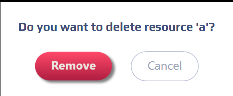
- Before deleting resources, a pop-up window appears with the text: "Do you really want to delete the resource?" and two buttons "Delete" and "Cancel"
Описание группы действий
| Оглавление |
|---|
Задача по реализации:
| JIRA | ||||||||
|---|---|---|---|---|---|---|---|---|
|
Наименование действия 1
Описание выполняемого действия
Настройки
...
Особые условия использования:
Должно быть предшествующее действие "Создать файл"
Наименование действия 2
Описание выполняемого действия
Настройки
...
Особые условия использования:
Отсутствуют
Наименование действия 3
Описание выполняемого действия
Настройки
...
Особые условия использования:
Отсутствуют
Обзор
Инструменты контента