История страницы
Logic of work:
- An exclamation mark icon
 appears in the "Variables
Логика работы:
- В панели "Переменные", "ФайлыFiles", "Web -элементыelements" , and "Win -элементы" появляется иконка восклицательного знака
 у каждого неиспользуемого в схеме ресурса.
 - Цвет восклицательного знака - #FF8000.
- Расположение: точка восклицательного знака находится на том же уровне, что и буквы названия ресурса.
- Ресурс считается неиспользуемым, если не указан во входных или выходных параметрах.
- Если ресурс используется в схеме робота, то иконка отсутствует.
- Если пользователь удаляет ресурс из схемы и он больше нигде не используется, то у ресурса в панели появляется иконка .
- Если пользователь создал ресурс вручную через панель, то иконка появляется сразу у созданного ресурса и остается пока ресурс не будет задействован в схеме.
- Если ресурс используется в отключенном действии, то иконка у такого ресурса отсутствует.
- Если пользователь добавляет неиспользуемый ресурс в схему, то иконка исчезает.
- Если пользователь указал свойство неиспользуемого ресурса, то иконка исчезает. Ресурс становится используемым.
Панель "Переменные"
- Иконка находится перед значком типа данных.
- Отступ иконкидо значка типа переменной - 8px.
- При наведении курсора на область переменной появляется тултип с описанием:
 . Описание на англ.: "This resource is not currently used in the schema.".
 - Размер шрифта в тултипе - 13.
- В примере на скриншотах желтым прямоугольником выделена область, наведя на которую, появляется тултип (реализовывать прямоугольник не надо).
- Тултип находится выше названия переменной, тем самым не загораживая её.
Панель "Файлы"
- Иконка находится между изображением файла и его названием.
- Отступ между изображением файла, иконкой и названием файла - 8px.
- При наведении курсора на область файла появляется тултип с описанием: . Описание на англ.: This resource is not currently used in the schema.".
- Размер шрифта в тултипе - 13.
- Тултип появляется выше названия файла, тем самым не загораживая его.
- В примере на скриншотах желтым прямоугольником выделена область, наведя на которую, появляется подсказка (реализовывать прямоугольник не надо).
Панель "Web-элементы"
- elements" panels at each unused resource in the scheme
- The color of the exclamation mark is #FF8000
- Location: The point of the exclamation mark is at the same level as the letters of the resource name
- A resource is considered unused if it is not specified in the input or output parameters
- If the resource is used in the robot scheme, the icon is not present
- If the user removes a resource from the scheme and it is no longer used anywhere else, the icon for the resource appears in the panel
- If the user created a resource manually via the panel, the icon appears immediately next to the created resource and remains until the resource is used in the scheme
- If a resource is used in a disabled action, the icon does not appear on the resource
- If the user adds an unused resource to the scheme, the icon disappears
- If the user has specified a property for an unused resource, the icon disappears. The resource becomes a used one
"Variables" panel
- The icon is located before the data type icon
- The indentation of the iconbefore the variable type icon is 8px
- A tooltip with a description appears when you hover the cursor over the variable area:

- The font size in the tooltip is 13
- In the example on the screenshots the yellow rectangle is highlighted area, pointing on which the tooltip appears (you don't need to realize the rectangle)
- The tooltip is located above the variable name, thus not blocking it
"Files" panel
- The icon is located between the file image and the file name
- The indentation between the file image, the icon and the file name is 8px
- When you hover over the file area, a tooltip with a description appears:
- The font size of the tooltip is 13
- The tooltip appears above the file name, thus not blocking it
- In the example on the screenshots, the yellow rectangle is highlighted as an area, hovering over which the tooltip appears (you don't need to realize the rectangle)
"Web elements" panel
- The icon appears next to the unused element and the group in which it is located
- The appears before the name of the element/group. If the element group does not have a name, the icon is at the beginning of the block
- The indentation from the icon to the element/group name is 8px
- A tooltip with a description appears when the cursor is placed over the element:
- When hovering the cursor over a group, a tooltip appears with the description: "
- Иконка появляется у неиспользуемого элемента и у группы, в котором он находится.
- Иконка находится перед названием элемента/группы. Если у группы элементов нет названия, то иконка находится в начале блока.
- Отступ от иконки до названия элемента/группы - 8px.
- При наведении курсора на элемент появляется тултип с описанием: . Описание на англ.: "This resource is not currently used in the schema.".
- При наведении курсора на группу появляется тултип с описанием: "В данной группе есть неиспользуемые ресурсы". Описание на англ.: "There are unused resources in this group".
- Размер шрифта в тултипах - 13.
- Тултип появляется выше названия элемента\группы, тем самым не загораживая названия.
- В примере на скриншотах желтым прямоугольником выделена область, наведя на которую, появляется подсказка (реализовывать прямоугольник не надо).
Панель "Win-элементы"
- The font size of the tooltips is 13
- The tooltip appears above the name of the element/group, thus not blocking the name
- In the example on the screenshots, the yellow rectangle is highlighted as an area, hovering over which the tooltip appears (you don't need to realize the rectangle)
"Win elements" panel
- The icon appears at the unused element and at the group in which it is located
- The icon appears before the name of the element/group. If the element group does not have a name, the icon is at the beginning of the block
- The indentation from the icon to the element/group name is 8px
- A tooltip with a description appears when the cursor is placed over the element:
- When you put the cursor over a group, a tooltip appears with the description
- Иконка появляется у неиспользуемого элемента и у группы, в котором он находится.
- Иконка находится перед названием элемента/группы. Если у группы элементов нет названия, то иконка находится в начале блока.
- Отступ от иконки до названия элемента/группы - 8px.
- При наведении курсора на элемент появляется тултип с описанием: . Описание на англ.: "This resource is not currently used in the schema.".
- При наведении курсора на группу появляется тултип описанием: "В данной группе есть неиспользуемые ресурсы". Описание на англ.: "There are unused resources in this group".
- Размер шрифта в тултипах - 13.
- Тултип появляется выше названия элемента\группы, тем самым не загораживая названия.
- В примере на скриншотах желтым прямоугольником выделена область, наведя на которую, появляется подсказка (реализовывать прямоугольник не надо).
Фильтр "Неиспользуемые"
Добавить фильтр "Неиспользуемые" в панели ресурсов. Данный фильтр будет выводить только неиспользуемые в схеме ресурсы.
Панель "Переменные"
- Добавить иконку фильтра перед иконкой сортировки.
- Иконки фильтра и сортировки находятся в одном паддинге.
- При нажатии иконка фильтра становится зеленой. Иконка остается все время зеленой, пока включен фильтр.
- Оформить фильтрацию аналогично с сортировкой: указать возможные фильтры, добавить кнопки
 и
и  .
. - В фильтрации доступен один фильтр -
 (на англ. Unused).
Панель "Файлы"
- Добавить иконку фильтра перед значком группировки.
- Иконки фильтра, группировки и сортировки находятся в одном паддинге.
- Оформить фильтрацию аналогично с сортировкой: указать возможные фильтры, добавить кнопки и .
- В фильтрации доступен один фильтр - (на англ. Unused).
- При нажатии иконка фильтра становится зеленой. Иконка остается все время зеленой, пока включен фильтр.
- Если в панели будет выбрана группировка по расширению файлов и применен фильтр "Неиспользуемые", то на панели будут выведены неиспользуемые файлы, разделенные по расширению.
Панель "Win-элементы"
- Добавить иконку фильтра перед иконкой добавления ресурса.
- Оформить фильтрацию аналогично с сортировкой: указать возможные фильтры, добавить кнопки и .
- В фильтрации доступен один фильтр - (на англ. Unused).
- При нажатии иконка фильтра становится зеленой. Иконка остается все время зеленой, пока включен фильтр.
- При использовании фильтра, на панели будут выведены группы, в которых есть неиспользуемые элементы и сами неиспользуемые элементы.
Панель "Web-элементы"
- Добавить иконку фильтра перед иконкой добавления ресурса.
- Оформить фильтрацию аналогично с сортировкой: указать возможные фильтры, добавить кнопки и .
- В фильтрации доступен один фильтр - (на англ. Unused).
- При нажатии иконка фильтра становится зеленой. Иконка остается все время зеленой, пока включен фильтр.
- При использовании фильтра, на панели будут выведены группы, в которых есть неиспользуемые элементы и сами неиспользуемые элементы.
Кнопка удаления ресурсов
Логика работы:
- На панели ресурса (переменная, файл, win-элемент, web-элемент) слева от иконки добавления добавить иконку корзины, при нажатии на которую удаляются все ресурсы из списка.
- Иконка корзины и иконка плюса находятся в одном паддинге.
- Если включен фильтр "Неиспользуемые", то при нажатии на значок корзины, удаляться только неиспользуемые ресурсы из списка.
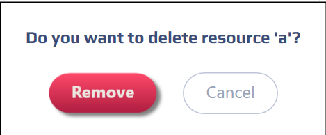
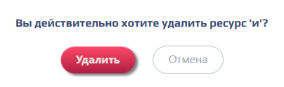
- Перед удалением ресурсов появляется всплывающее окно с текстом: "Вы действительно хотите удалить ресурс?", а также с двумя кнопками "Удалить" и "Отмена".
- The font size of the tooltips is 13
- The tooltip appears above the name of the element/group, thus not blocking the name
- In the example on the screenshots, the yellow rectangle is highlighted as an area, hovering over which the tooltip appears (you don't need to realize the rectangle)
"Unused" filter
Add the "Unused" filter to the Resources panel. This filter will only display resources that are not used in the scheme.
"Variables" panel
- Add a filter icon before the sorting icon
- The filter and sorting icons are in the same paddings
- When clicked, the filter icon turns green. The icon remains green at all times as long as the filter is enabled
- Format filtering in the same way as sorting: specify the possible filters, add the buttons
 and
and 
- One filter is available for filtering -

"Files" panel
- Add a filter icon in front of the grouping icon
- The filter, grouping and sorting icons are in the same paddings
- Format filtering in the same way as sorting: specify the possible filters, add the buttons
and
- One filter is available for filtering -
- When you click on it, the filter icon turns green. The icon remains green as long as the filter is enabled
- If grouping by file extension is selected in the panel and the "Unused" filter is applied, the panel will display unused files separated by extension.
"Win-elements" panel
- Add a filter icon before the add resource icon
- Format the filtering in the same way as for sorting: specify the possible filters, add the buttons
and
- One filter is available for filtering -
- When you click on it, the filter icon turns green. The icon remains green as long as the filter is enabled
- When you use the filter, the groups that contain unused items and the unused items themselves will be displayed in the panel
"Web-elements" panel
- Add a filter icon before the add resource icon
- Format the filtering in the same way as for sorting: specify the possible filters, add the buttons
and
- One filter is available for filtering -
- When you click on it, the filter icon turns green. The icon remains green as long as the filter is enabled
- When you use the filter, the groups that contain unused items and the unused items themselves will be displayed in the panel
Button for deleting resources
Logic of work:
- On the resource panel (variable, file, win-element, web-element), to the left of the add icon, add a cart icon that when clicked, removes all resources from the list
- The cart icon and the plus icon are in the same paddings
- If the "Unused" filter is enabled, then when you click on the cart icon, only unused resources from the list are deleted
- Before deleting resources, a pop-up window appears with the text: "Do you really want to delete the resource?" and two buttons "Delete" and "Cancel"
Обзор
Инструменты контента